The transportation impact of warehouse clusters: Freight data from Loop 303
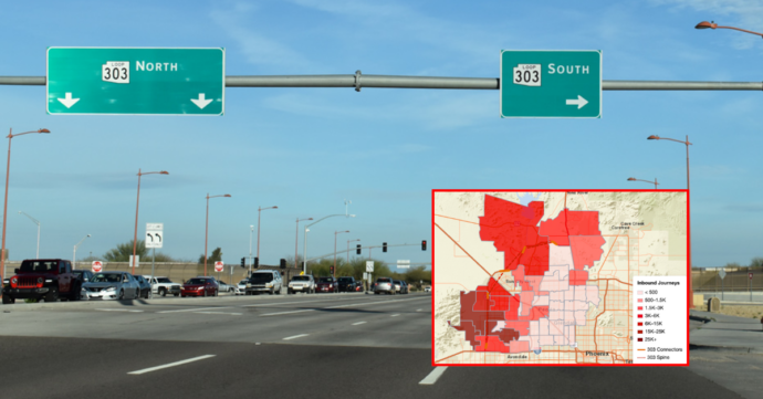
How warehouse cluster growth is changing truck traffic near Phoenix’s Loop 303 — freight O-D data on leakage, exit ramp load and vocation mix shifts.


A series exploring the Health of the U.S. Supply Chain report and how truck movements connect across DOTs, MPOs and city planners. Here we identify a handful of “edge” metrics that can help DOTs see past their usual dashboard.
Are you watching your edges? Commercial travel doesn’t just appear and disappear on state corridors. Each vehicle has a focused purpose with related trend information that your dashboard may not be capturing because it happens outside your network. But a glance into the marginsing their city. of those trips can offer early insights into what’s next for your system.
This metric represents what percentage of the trucks and vans on a city’s streets are doing last-mile delivery, and so it usually lives in a city planner’s world. It’s the kind of number that shows up in curb-management studies and parking-policy debates to describe how much of the daily traffic is delivery vehicles versus everything else.
Why a DOT should care: A rising vehicle share doesn’t stay contained inside city limits. Delivery vans have to get into the city somehow, and that means more of them are passing through the interchanges, connector roads and state routes where city streets meet highway networks.
If a city’s last-mile fleet is growing, that growth often shows up first by more distinct vehicles traveling through those edge-of-city connection points before they create downtown congestion. For a DOT official monitoring connector-road capacity or interchange upgrades, it can be an early signal worth watching.
Real-world example: In our report, New York’s share of commercial vehicles classified as Door-to-Door delivery reached roughly 48% and kept climbing across the three quarters we studied. That’s nearly half of all commercial traffic tracked in the city. Although it’s a city-level statistic, the trend line behind it — more delivery vehicles, steadily rising — is a leading indicator a DOT would want to monitor for the roads feed
Utilization rate measures how hard a fleet is being worked by measuring the percentage of available working days a vehicle is actually out on the road running trips. It’s typically an operations metric, used by logistics companies to decide whether they need to buy more trucks, or by MPOs for warehouse and distribution-center siting studies to figure out where freight facilities are running lean versus running full.
Why a DOT should care: When a fleet’s utilization rate keeps climbing quarter over quarter, it means the network is running out of slack. Those trucks are already working nearly every available day, with little room to absorb more demand without adding vehicles.
That matters to a DOT because when a tight network finally hits its ceiling and has to expand by adding new trucks. Those new trips will usually flow onto the nearest arterial or interstate corridor, potentially creating bottlenecks.
In other words, a rising utilization rate today is essentially an early warning that new freight trips are coming soon to a highway near you. Catching that trend early gives a DOT lead time to plan for it, instead of reacting after the corridor is already congested.
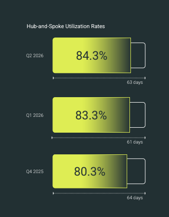
Real-world example: In our report, Hub-and-Spoke fleets — the trucks that move goods between hubs and local delivery points — saw utilization climb to 84.3% by the end of the study period, the highest point across all three quarters. That’s a fleet running close to its ceiling. If demand keeps growing, operators won’t be able to squeeze more out of the trucks they already have. They’ll need to add more trucks, which means more trips hitting the road network.
What it normally means: This compares how much freight is moving by two different modes at the same location – most commonly truck versus rail from a port or intermodal yard. This metric is usually tracked by a port authority or rail operator to show if shippers are choosing trucks or trains to move containers out of the port.
Why a DOT should care: When truck volume and rail volume at the same location start moving in opposite directions — one rising while the other falls — that’s a sign freight is being redistributed between modes. That redistribution can have real consequences for infrastructure a DOT owns and maintains. Those areas can include grade crossings near rail yards, the highway segments that lead to and from ports and intermodal facilities and along the local roads that see truck traffic ramp up or down during mode shifts.
The freight isn’t disappearing, it’s just choosing a different path through the network. DOTs need to know which path those trips are taking, even though the underlying cause (a shipper’s mode choice) has nothing to do with highways directly.
Real-world example: Our report found that at the San Pedro Bay ports (Los Angeles and Long Beach), truck trips moving containers out of the port fell by about 1% during the study period. At the same time, the ports’ official container volume figures rose by about 2%. Trucks were moving less freight even though the ports were handling more of it, and the most likely explanation is that rail picked up the difference. For a DOT, that’s a signal to watch grade-crossing and rail-corridor capacity near the port more closely.
Vehicle share, utilization and mode share at the regional and city level may not take front and center on your dashboard, but these edge metrics can surface early warnings for DOT impact. As a trend indicator, it’s worth checking to see what’s coming next.
To see which freight signals are already heading for your corridors, and how to interpret them, get the full Health of the U.S. Supply Chain report.
Local delivery and freight trends often reach state highways before they show up as congestion on a DOT’s own dashboard. Watching city and MPO data gives planners an early signal for interchange, connector-road and corridor capacity needs.
It means a freight network is running out of slack. Once fleets are consistently working most of their available days, any new demand is likely to be met by adding trucks rather than running existing ones more efficiently, which translates directly into new trips on the road network.
It moves the infrastructure burden rather than removing it. Even if truck volume at a port or intermodal yard declines, that freight may still be increasing overall, just moving through rail corridors and grade crossings instead of highway approaches.
An edge metric is a freight indicator that normally belongs to another group, such as a city planner or port authority, but still affects state-owned infrastructure. Tracking these metrics helps DOTs spot freight trends before they become visible as congestion on their own corridors.
How warehouse cluster growth is changing truck traffic near Phoenix’s Loop 303 — freight O-D data on leakage, exit ramp load and vocation mix shifts.
The Tennessee Department of Transportation has chosen Altitude by Geotab for a four-year subscription contract through The Eastern Transportation Coalition. TDOT will access Altitude’s comprehensive transportation analytics suite to support planning and performance measurement.
Discover what truck parking data is available for transportation agencies, from journey thresholds to peak demand hours, to prioritize corridors and strengthen funding requests.