
3 freight metrics that improve truck traffic forecasting for state DOTs
State DOTs can forecast truck traffic earlier by watching freight metrics from city and port data. Here are 3 signals worth tracking.


A series exploring the Health of the U.S. Supply Chain report and how truck movements connect across DOTs, MPOs and city planners. Here we identify a handful of “edge” metrics that can help DOTs see past their usual dashboard.
Looking for new data sources for MPO freight planning? You might not think of DOT dashboards or city curb-management studies, but those can be rich sources of Regional truck data. Some of the most useful signals for regional planning can show up clearly when you step back and look across jurisdictions.
Continuing our deeper dive into the Health of the U.S. Supply Chain report, this edition examines how commercial vehicle movements link state DOTs, regional MPOs and urban planners. We isolate three indicators that look like localized municipal or corridor metrics, yet can reveal critical regional trends for MPOs.
This is essentially a speed or pace proxy — how long a trip takes compared to how far it goes. It is generally a metric that DOTs reference for congestion monitoring, pavement-condition assessments and corridor performance reports. If trips are taking longer to cover the same distance, a DOT reads that as a sign the road itself is getting more congested or degraded.
Why an MPO should care: A slow, steady creep in trip duration without a matching increase in the miles being driven doesn’t always mean congestion on that corridor is the problem. It can be a softer signal indicating that local roads or regional connectors feeding into that corridor are getting more backed up, and that friction is bleeding into the bigger route’s travel times before it ever becomes bad enough for a DOT to formally flag it as a chokepoint.
That’s an early warning signal that an MPO can use. It points to a regional bottleneck still forming, one that could potentially be addressed through land-use or regional-connector planning before it hardens into a capital project on a DOT’s capacity-expansion list.
Real-world example: In our report, Long-Haul trips saw their median journey time rise from 8.60 hours to 8.71 hours across the three quarters studied, while the total mileage of those trips stayed roughly flat. Trucks weren’t driving farther, they were just taking more time to cover the same ground. That’s a small shift, but it’s the kind of gradual friction an MPO could catch in a regional plan long before it reaches DOT awareness.
On its own, in any single city, a pattern of more delivery trips while the average length of each trip shrinks seems like a local curb-management issue. More delivery vehicles making more frequent, shorter stops is a data point a city planner would notice in permit requests or double-parking complaints.
Why an MPO should care: The picture changes when that same pattern shows up in multiple cities across a region at the same time. When a city-by-city curb problem starts trending in multiple places, that’s a regional land-use signal. It can mean that delivery networks are getting denser with more micro-fulfillment centers, smaller local depots or “dark stores” popping up closer to where people live. Then, carriers make more frequent, shorter runs instead of fewer, longer ones. That’s a shift an MPO should be planning for in its regional land-use and freight facility siting work, rather than leaving each city to react to its own version of the same problem independently.
Real-world example: All four cities we studied — Atlanta, Denver, Los Angeles and New York — saw Door-to-Door trip volume rise while average miles per trip fell in the same quarter. Four different metros moving the same direction at the same time isn’t necessarily a coincidence worth treating city by city. It could be a pattern an MPO is better positioned to plan around at the regional level.
Comparing how fast Long-Haul freight is growing versus Regional (shorter-haul) freight sounds like a DOT interstate-corridor statistic. This metric would show up in a report about how much traffic a major highway corridor is carrying and how that’s changing over time.
Why an MPO should care: When the shorter-haul tier is growing noticeably faster than the Long-Haul backbone, it could mean something is changing where goods are being stored, not just how they’re being driven. Inventory may be moving closer to the metro (into regional warehouses and distribution points nearer the urban core) instead of sitting farther out and traveling the “last leg” via Long-Haul trucking. That’s a land-use signal, not just a traffic one, and MPOs may want to prioritize industrial-zoned land closer to the metro in its next regional plan update, since demand for that kind of space is likely to keep climbing.
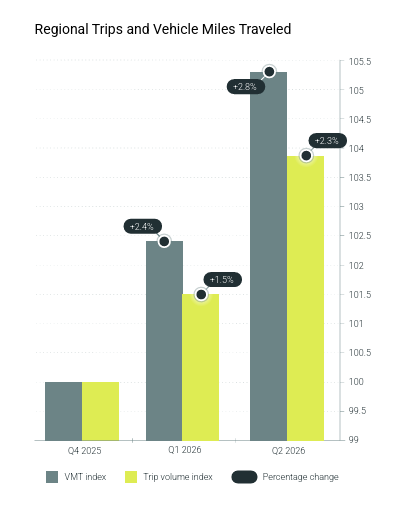
Real-world example: In our analysis, Regional trip volume grew 3.8% over the study period, compared to roughly 0.7% growth for Long-Haul over the same three quarters. Regional freight — the shorter-haul tier that moves goods closer to their final destination — grew more than five times faster than the Long-Haul backbone. That gap should show up in an MPO’s industrial land-use conversations, even though the raw numbers themselves look like a corridor-volume statistic.
These three metrics — trip duration, delivery frequency and freight-tier growth — may not look unusual in isolation. But when an MPO planner holds them up against data from neighboring jurisdictions then patterns become visible. A regional bottleneck may be taking shape, freight could be shifting toward denser last-mile networks or networks may be shifting where goods are being warehoused before their final leg.
An MPO has a regional perspective that a DOT or city planning office doesn’t. Watching these edge metrics across jurisdictions, rather than waiting for them to surface as capacity requests or capital projects, gives planners a head start on the land-use and infrastructure decisions that follow.
To see which freight signals are already heading for your corridors, and how to interpret them, get the full Health of the U.S. Supply Chain report.
DOT dashboards (congestion and pavement-condition metrics) and city-level curb-management or delivery-permit data are often overlooked but valuable sources. Individually they look like local or corridor-specific statistics, but when compared across jurisdictions they can reveal regional freight and land-use trends before they show up as formal capacity requests.
It’s an early signal that local roads or regional connectors feeding into a corridor are becoming more congested, even if the corridor itself isn’t yet flagged as a chokepoint by a DOT. In our study, median Long-Haul journey time rose from 8.60 to 8.71 hours over three quarters while mileage stayed roughly flat. This is a pattern MPOs can catch and address through land-use or connector planning before it becomes a capital project.
A single city seeing more frequent, shorter delivery trips looks like a local curb or double-parking problem. But when the same pattern appears in multiple cities in the same region at the same time — as it did across Atlanta, Denver, Los Angeles, and New York in our study — it signals denser last-mile delivery networks (micro-fulfillment centers, local depots, dark stores) forming regionally. This trend is better addressed through coordinated regional land-use and freight facility siting than with city-by-city reactions.
When Regional (short-haul) freight volume grows significantly faster than Long-Haul freight, it suggests inventory is moving closer to the metro core rather than sitting in distant warehouses. In our analysis, Regional truck trip volume grew 3.8% versus about 0.7% for Long-Haul over the same period — over five times faster — signaling rising demand for industrial-zoned land closer to the urban core that MPOs should prioritize in regional plan updates.
State DOTs can forecast truck traffic earlier by watching freight metrics from city and port data. Here are 3 signals worth tracking.
How warehouse cluster growth is changing truck traffic near Phoenix’s Loop 303 — freight O-D data on leakage, exit ramp load and vocation mix shifts.
The Tennessee Department of Transportation has chosen Altitude by Geotab for a four-year subscription contract through The Eastern Transportation Coalition. TDOT will access Altitude’s comprehensive transportation analytics suite to support planning and performance measurement.