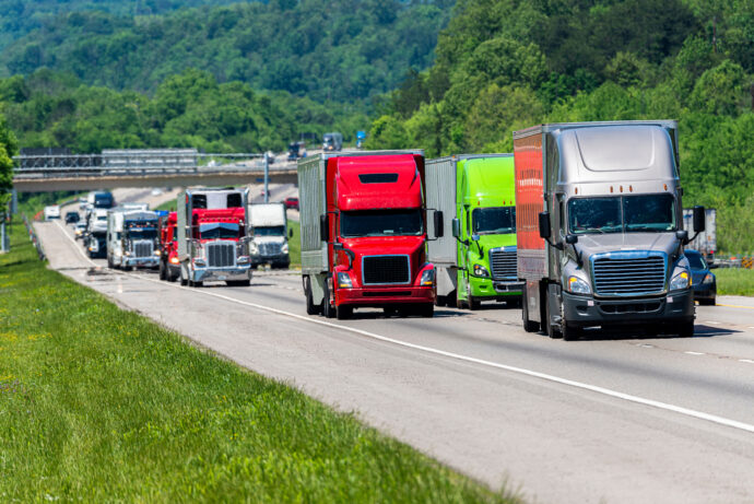

A planner’s checklist: What telematics data can (and can’t) do for freight planning
Telematics data for freight planning complements traditional sources. Our checklists share what telematics data can and can’t do to support freight planning.

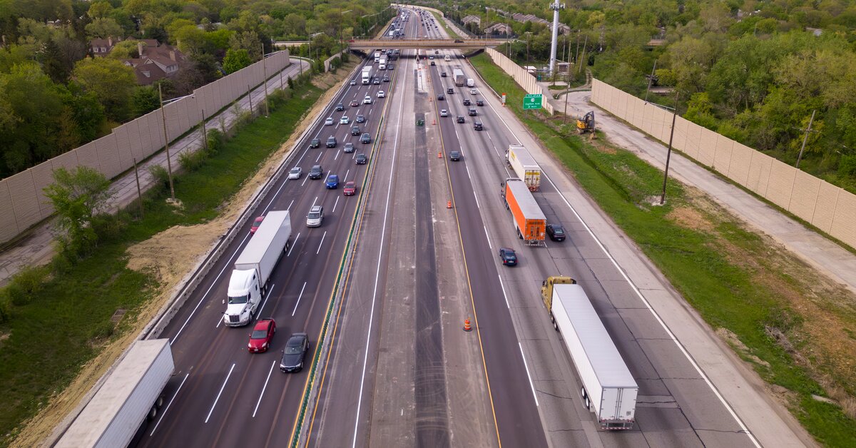
Definition: Harsh event data records instances where a commercial vehicle’s GPS-based acceleration exceeds approximately 3 meters/second², identifying high-risk driving locations. There are two types:
Harsh event data can be filtered by corridor, day of week, time of day, vehicle type, vehicle class, vocation and industry.
What planners use it for:
| Use Case | Example |
|---|---|
| Targeted enforcement in high-risk areas | A city identifies a cluster of harsh braking events along one corridor during weekday evening rush hour and directs enforcement there during those hours. |
| Driver awareness campaigns | A freight authority sees repeated harsh acceleration near a school zone and issues a targeted safety bulletin to fleets in that area. |
| Optimized traffic signal timing | An intersection flagged for high harsh-braking rates gets retimed signals, resulting in a measurable drop in harsh events afterward. |
| Enhanced route planning | A corridor with persistently high harsh event rates prompts a truck routing redesign around a problematic merge point. |
Case example: Altitude analyzed connected vehicle data from medium- and heavy-duty commercial trucks across Colorado over an 11-month period (January–November 2024), measuring harsh events per 10,000 vehicle traversals. The data showed harsh events concentrated around Denver and extending into the suburbs in all directions, with two additional hotspots outside the metro area — one near Fort Collins and another along I-70 west of Denver.
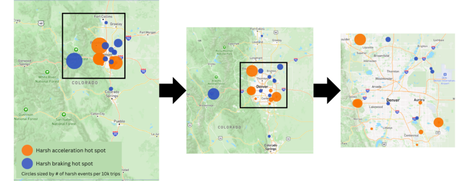
Notably, the I-70 mountain-pass corridor showed a heavy skew toward harsh braking events specifically, pointing to the terrain itself — not just traffic volume — as a contributing factor. That distinction matters for planners: a hotspot driven by steep grades and sharp curves calls for a different response (signage, runaway truck ramps, speed advisories) than one driven by intersection conflicts or congestion.
Key takeaway: Harsh event data is a leading (predictive) safety indicator, not a lagging one built from crash reports after the fact.
Definition: Speed analysis data measures how vehicles actually travel across specific road segments, filtered by vehicle type, class, vocation, and industry. Four core metrics:
| Metric | Definition |
|---|---|
| Spot speed | The highest speed a vehicle reaches on a road segment. |
| Free-flow speed | The 85th-percentile spot speed over the past month, representing ideal travel conditions. |
| Travel speed | Total distance divided by total duration, including idling time. |
| Running speed | Average speed excluding stops and idling. |
What planners use it for:
| Use Case | Example |
|---|---|
| Verifying traffic-calming eligibility | A planning office confirms a road meets a defined speeding threshold using filtered speed data instead of manual radar monitoring. |
| Before/after evaluation of interventions | Speeds around a school zone are compared before and after a traffic-calming installation to confirm effectiveness. |
| Vetting community complaints | Filtered speed data for a specific block and time span confirms whether a resident’s speeding complaint reflects an actual pattern. |
| Prioritizing limited resources | Streets are ranked against known high-injury corridors and school zones so funding goes only to locations that meet the threshold. |
Case example: New York City’s Office of Research, Implementation & Safety (RIS) uses a defined threshold — 15% of vehicles traveling 5+ mph over the speed limit — to flag streets as traffic-calming candidates. Previously verified through manual radar monitoring, this is now confirmed using filtered speed data by time of day, date range, and vehicle class. RIS used this approach to compare pre- and post-installation speeds around a school zone, confirming the traffic-calming treatment reduced speeding, and to prioritize Vision Zero “Priority Geographies” and school zones over lower-risk complaint locations.
Key takeaway: Speed data replaces slow, resource-intensive manual radar monitoring with continuous, filterable, trusted data.
Definition: O-D data reconstructs “chained trips” — linking consecutive vehicle movements into complete journeys across geographic zones and road segments — to produce Origin-Destination matrices, stop durations, and route patterns. Filterable by vehicle type, vocation, and industry.
What planners use it for:
| Use Case | Example |
|---|---|
| Freight planning | O-D data shows long-haul trucks detouring through a residential arterial instead of the designated freight corridor, prompting a fix at the underlying chokepoint. |
| Site selection | Trip origin, timing, and purpose data identifies the optimal location for a new distribution facility along high-volume routes. |
| Infrastructure planning | Movement patterns through a growing suburban zone inform where a new interchange or arterial widening would have the most impact. |
| Regulatory compliance | Trip and zone data demonstrates compliance with regional transportation planning mandates. |
| Passthrough analysis | High-volume, non-stopping trips through a residential zone support through-truck restrictions or rerouting signage. |
| Route optimization | Long-haul vehicle behavior across a freight corridor informs logistics routing improvements that reduce empty miles and congestion. |
Case example: A regional planning authority evaluating freight corridor investment uses O-D data to find that a disproportionate share of long-haul truck trips route through a residential arterial rather than the designated freight corridor — caused by a chokepoint further along the intended route. This movement-pattern evidence supports both an infrastructure fix on the freight corridor and a passthrough traffic-calming intervention on the residential arterial.
Key takeaway: O-D data reveals full-journey movement patterns, not just point-in-time or segment-level snapshots.
| Dataset | What it measures | Primary planning value |
|---|---|---|
| Harsh events | Sudden acceleration/braking events | Leading indicator of collision risk |
| Speed analysis | Spot, free-flow, travel, and running speed | Roadway performance and traffic-calming justification |
| Origin-Destination | Full chained-trip movement patterns | Freight, infrastructure, and site-selection planning |
The three commercial vehicle datasets transportation planners rely on most are harsh event data (safety risk), speed analysis (roadway performance), and Origin-Destination data (movement patterns) — together replacing reactive, anecdote-driven planning with continuous, filterable, evidence-based decision-making.
Learn more about how transportation data works, including collection, validation and reliability in our Expansion Factors 3.0 white paper.
Three datasets see the most consistent use at Altitude by Geotab: harsh event data (harsh acceleration and harsh braking), speed analysis data (spot, free-flow, travel, and running speed), and Origin-Destination (O-D) data that traces full chained trips across zones and road segments.
Harsh event data is a leading indicator — it flags risky acceleration and braking patterns (GPS-based acceleration exceeding ~3 m/s²) before a collision happens, rather than a lagging indicator built from crash reports after the fact.
Free-flow speed is the 85th-percentile spot speed over the past month under ideal conditions; travel speed is total distance divided by total duration including idling; running speed is average speed excluding stops and idling — each answers a different question about how a road segment actually performs.
Filtered speed data lets planners verify whether a road actually meets a defined speeding threshold, vet community complaints against real patterns instead of anecdote, and measure before/after speed changes to prove an intervention worked.
By reconstructing full chained trips instead of single road segments, O-D data reveals the underlying movement pattern, such as a chokepoint causing trucks to detour through unintended routes, so planners can address the root cause rather than just the symptom.
Telematics data for freight planning complements traditional sources. Our checklists share what telematics data can and can’t do to support freight planning.
New data sources for MPO freight planning: 3 overlooked metrics that reveal regional trends before they hit your dashboard.
State DOTs can forecast truck traffic earlier by watching freight metrics from city and port data. Here are 3 signals worth tracking.